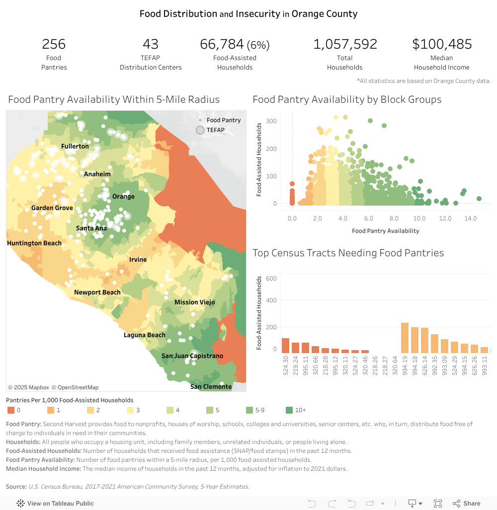
Food Pantry Accessibility Analysis
Purpose
This dashboard helps decision-makers identify optimal locations for new food pantries by evaluating both need and accessibility at a 5-mile radius level.
How to Use This Dashboard
- Find low-access areas → Red/orange areas have the worst availability.
- Check household volume → Prioritize locations with 50+ food-assisted households.
- Select priority areas → Click and drag on the scatter plot to filter census tracts on the map and bar chart.
Interactive Dashboard
View Dashboard on Tableau Public
Key Insights & Impact
- 464 households identified with no local pantry access.
- Located strategic sites where a new pantry could serve 3,000+ households.
- Mapped food insecurity gaps to help optimize food bank operations.
The Metric Behind the Color Coding
\[\frac{\text{Number of Food Pantries*}}{\text{Households Receiving Food Assistance* / 1000}} \qquad\qquad \tag*{* within 5 Miles}\]Why This Metric?
This metric helps identify food pantry gaps more effectively than using raw numbers alone:
- 5-mile radius → Ensures fair comparisons since census tracts vary widely in size.
- Dividing by 1,000 → Standardizes the ratio for easier interpretation.
- Balancing need and access → Highlights distribution gaps by factoring in both pantry availability and the number of food-assisted households.
Technical Approach
This project integrates geospatial analysis, census data, and web scraping to identify underserved areas.
Tools Used
- R 4.3.2 (
tidycensus,sf,dplyr,ggplot2,stringr) → For data processing & geospatial analysis. - Tableau Public → For interactive visualization.
Data Sources
- Food Pantry Locations → Web-scraped from Second Harvest of Orange County.
- Census Data → U.S. Census Bureau (ACS 2017-2021 5-Year Estimates), accessed via R.